
Brand Identity
Scrollish.co
The Gap
Business content and personal invitations speak to different audiences, but both need to feel personal. Scrollish.co explores how one creative identity can serve both—balancing the personality of a content studio with the care that personal occasions call for.
The Approach
An approachable identity with a playful character.
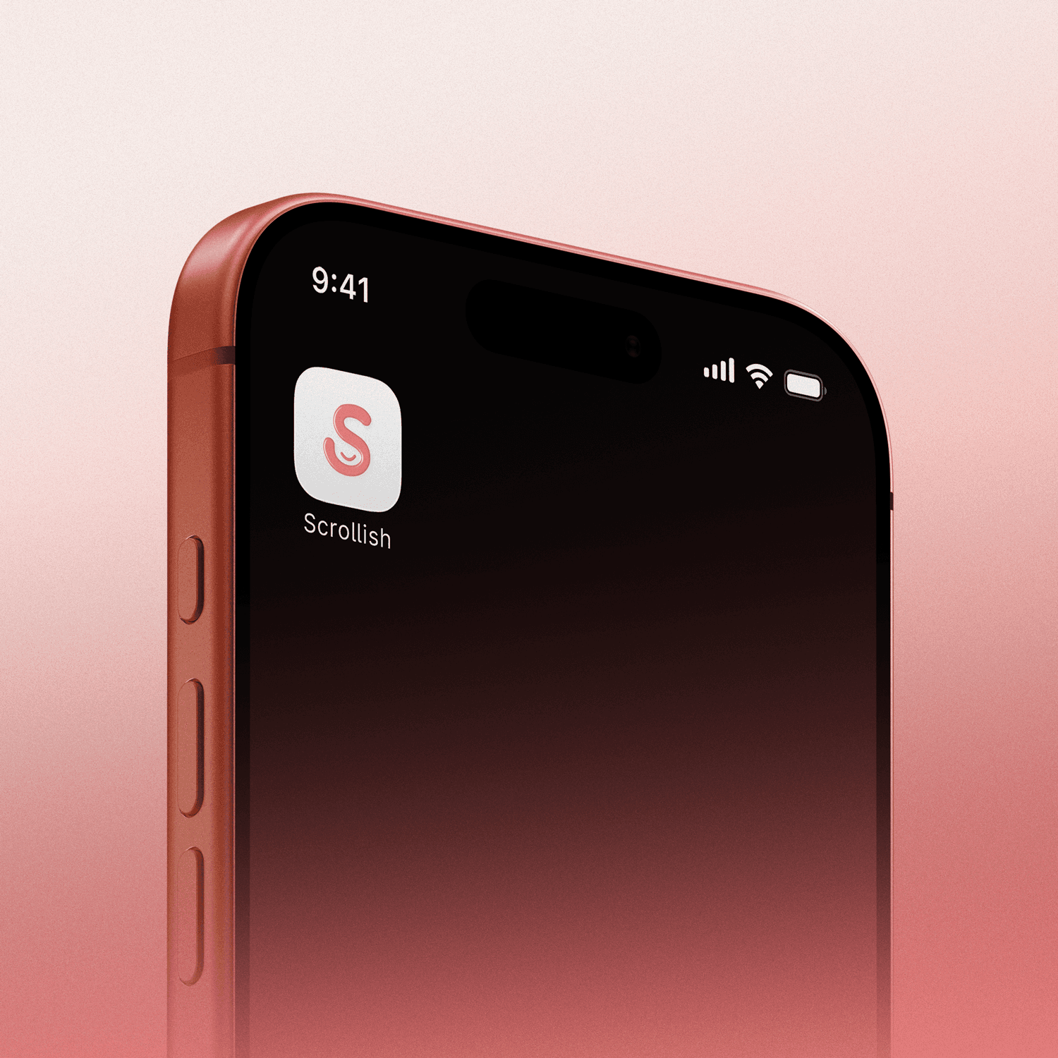
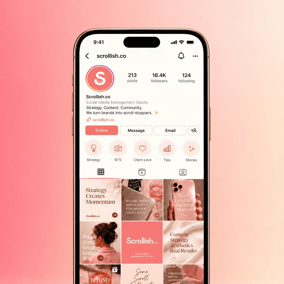
We built Scrollish.co’s visual identity around rounded, expressive lettering, with small smile details in the “S” and “o” making friendliness part of the wordmark itself. Coral tones and a soft peach gradient carry that warmth through the logo, while the circular “S” gives the identity a compact, standalone symbol.
The wider palette, typography and graphic elements balance playful expression with a more considered finish. Together, these choices establish a visual language for a business spanning social content and event invitations, with enough personality to feel distinctive and enough restraint to suit different occasions.
The Work

The Outcome
Approachability can be built into the smallest details. Scrollish.co explores how lettering, colour and a simple smile can give a broad creative offering a clear, friendly character.