Menu
Brand Identity
Crafting Brewzone's Brand
Graphic Design
Brand Identity
The Gap
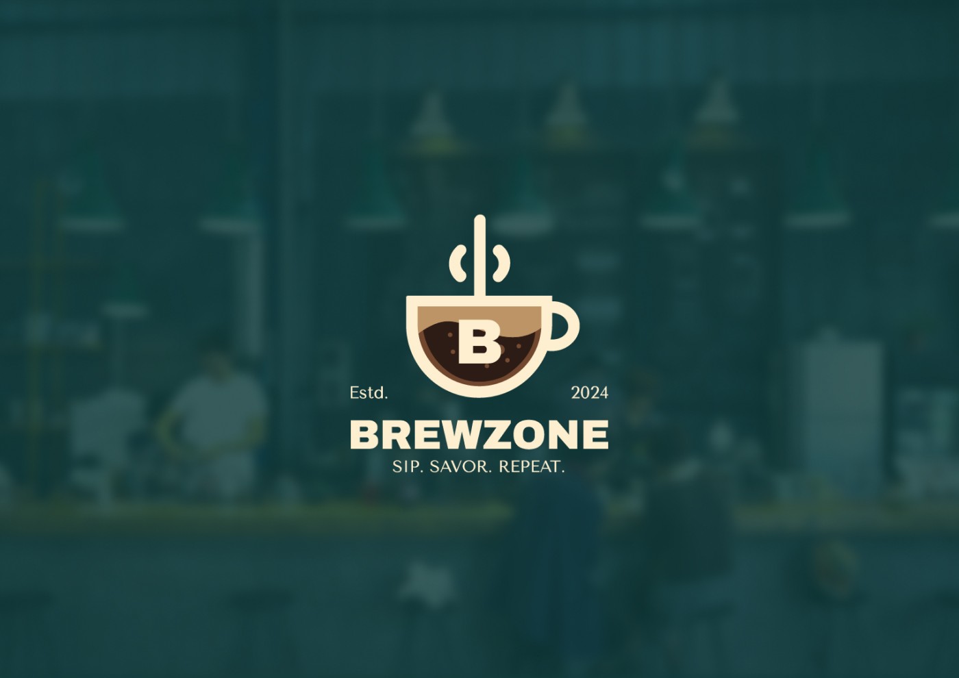
Brewzone had a vision. A premium specialty coffee brand built for people who take their cup seriously. What they didn't have was a name, a mark, or a single visual asset to show for it. They came to us at zero: no identity, no language, no system. Just an idea that needed to become a brand.
The Approach
We knew from the start that Brewzone would live on shelves and screens simultaneously, so we designed for both from day one. Rather than working backwards from a logo, we built the brand system outward, establishing the visual language first, then letting the logomark, typography, and color palette grow from it. Every decision was made to feel considered and premium, not just at launch, but at scale. The deliverables: a complete logo system, a brand guidelines document, and a website - all speaking the same language.
The Work
The Outcome
Brewzone launched with a brand that looked like it had been around for years. The identity gave the team a clear, confident visual voice to carry into every customer touchpoint, from packaging to digital, without needing to second-guess a single design decision.
We had the product. OTP gave us the presence.
Founder, Brewzone